After crafting a similar look for London, cognitive psychologist and map enthusiast reimagines the New York City subway system in circles. “Rather than emphasize straight lines, clean angles, and geographical accuracy, Roberts’ maps embody a more nuanced approach to mapping, one that combines aesthetics with usability.” Well, it looks nice…but I’m quite fond of “geographical accuracy” in maps as well.
Category: Maps and Legends
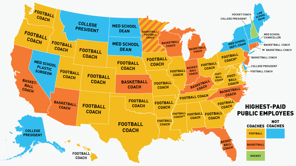
America By Coach.
Deadspin’s Reuben Fischer-Baum conjures up a map of the highest-paid public employee in each state, and, yes, it’s usually a coach. By way of comparison, the college players actually bringing in all the revenue get…nada.
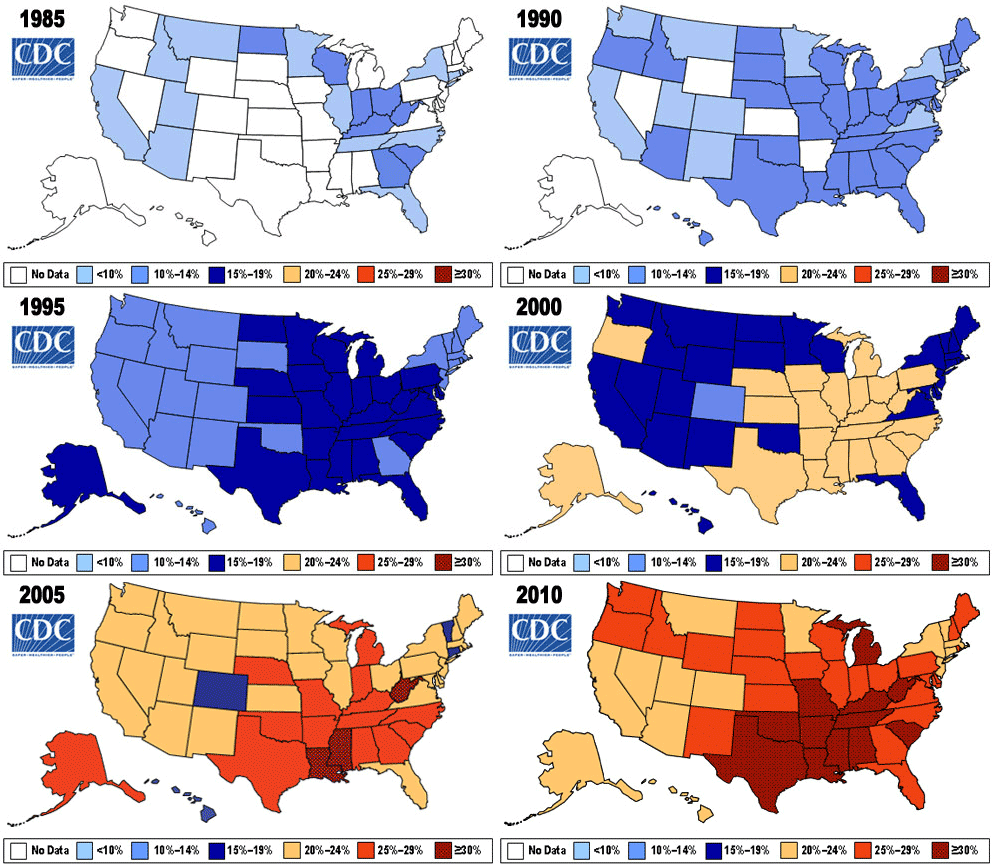
The Expanding Nation.
A troubling GIF captures twenty-five years of expanding waistlines in America. “Meanwhile, through 2012, no state has met the CDC’s nationwide goal to reduce obesity to 15 percent.” Update: The states behind the curve? Everyone could be lying.
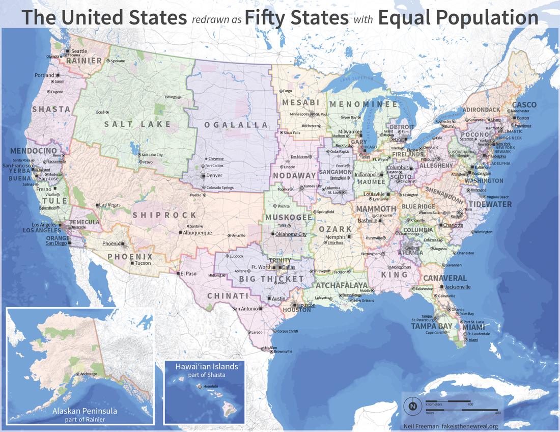
From Mendocino to the New York Island…
A lot of people may dream of a new America, but artist Neil Freeman has actually drawn one up, with the aid of some number-crunching algorithms. “Keep in mind that this is an art project, not a serious proposal, so take it easy with the emails about the sacred soil of Texas.”
Mr. Smith Moved to Washington.
“America is a nation of Smiths, Johnsons, and Sullivans — but also of Garcias and Nguyens. Zoom in on the map below to see what surnames proliferate in your part of the country.” By way of a friend, National Geographic breaks down America by surname. Good to see the Murphys holding it down in Massachusetts.
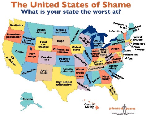
We’re No. 50!
On the eve of the State of the Union — Win the Future! — the wags at Pleated Jeans compile a handy map of what each state desperately needs to work on. (By way of Blackpepper and Webgoddess.) “Whether it’s a fat population, high rate of STDs or excessive tax rate, it turns out that every state ranks dead last in at least one unsavory category. Check out the map (click image to enlarge) to see what your state is the worst at, then review additional stats and references after the jump.”
Everything’s Bigger in Texas.
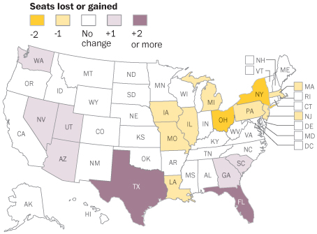
“The westward movement of the U.S. population means six districts in states that went for Obama will shift to states that went for McCain — a small but significant shift that could help a GOP presidential candidate in 2012, provided they can hold those states for the party.“
The US Census Bureau announces the newly-reapportioned electoral map for 2010, and it shows electoral gains for (blue areas in) red states and the Northeast and Midwest diminishing (in growth rate, at least. The only state to actually lose people was Michigan.) Since the GOP will by and large control the redistricting process in most states, this is further bad news for Dems in the short term. Nonetheless, the overall demographic trends are still working in our favor.
In related news, Robert Cruickshank makes the modest proposal of removing the 435-member cap on the House, first passed in 1929. “In the 1930 Census, which found a population of just over 122 million, this produced 435 House districts of about 282,000 each. By 2012, however, a US House district in a state with more than 1 seat will represent about 708,000 people. That’s an increase of 2260% from 1790.“
Red Queue, Blue Queue.
By way of the NY Times, here’s a map of what Americans are renting from Netflix. Apparently, the Fort Myers military base at zip code 22211 has radically different viewing tastes than the rest of DC, and Manhattan and Brooklyn (but not New Jersey) love them some Mad Men.
All Your Base Are Belong to Us.
Oops, sorry Kentucky.
By way of Do You Feel Loved and Ed Rants respectively, see how many member UN nations (143) and American states (49) you can name in ten minutes. Harder than you might think, particularly if you go about it randomly rather than systematically. (Or, at least, that’s my excuse.)